
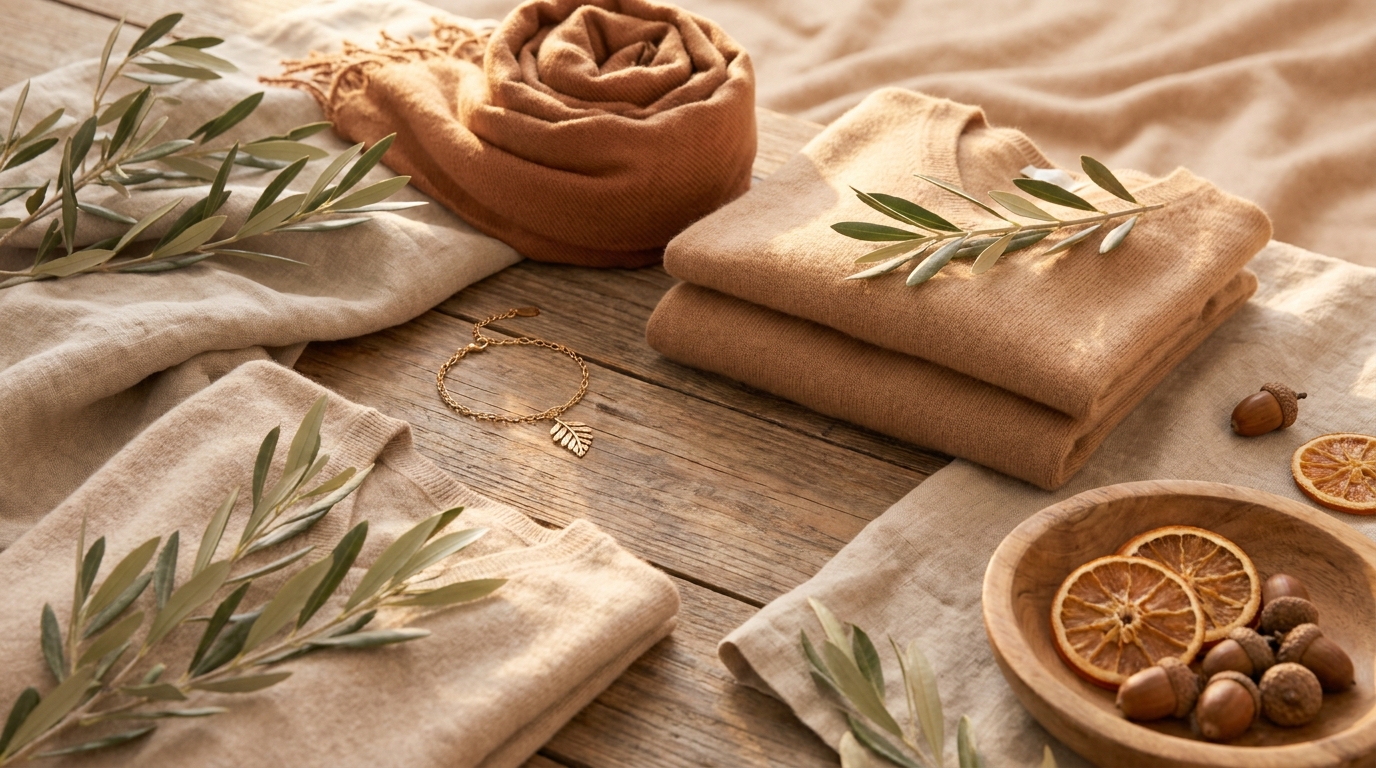
Soft autumn color palette sets the tone for a world of muted warmth, earthy softness, and naturally blended beauty that enhances rather than overwhelms your features. Soft autumn color palette feels like golden light filtered through dry leaves, creating a calm, harmonious aesthetic that instantly elevates your style and presence without trying too hard.
There is something quietly powerful about this palette. It does not scream for attention, yet it consistently draws it in through subtle richness and balanced warmth. Whether you are exploring seasonal color analysis for personal styling or simply refining your wardrobe, the soft autumn color palette offers a grounded and flattering direction that feels both timeless and deeply wearable.
The quiet beauty hidden inside soft autumn color palette tones
The soft autumn color palette is defined by warmth blended with softness rather than brightness or sharp contrast. It sits between true autumn and summer, which gives it a muted, dusty quality that feels gentle on the eyes. Nothing appears overly saturated, yet everything feels intentionally refined.
People who naturally align with the soft autumn color palette often have low-to-medium contrast in their features. Their skin, eyes, and hair flow into one another instead of standing apart. Because of this harmony, soft autumn shades enhance natural beauty instead of overpowering it.
Think of early fall landscapes when sunlight is slightly hazy and colors appear softened by distance. That is the essence of the soft autumn color palette.
Signature colors that define the soft autumn color palette
The soft autumn color palette revolves around warmth, earthiness, and a slightly muted finish. These tones avoid harshness and instead lean into a dusty, sun-washed softness that feels naturally elegant.
Key shades include warm beige, muted olive, dusty peach, soft terracotta, camel brown, warm taupe, and gentle mustard. Each color within the soft autumn color palette carries warmth but remains subdued enough to maintain balance.
Instead of bright white, soft ivory works better. Instead of pure black, espresso brown or softened charcoal feels more natural. Even blues appear more muted, like slate blue or dusty teal rather than vivid navy.
These tones work together because the soft autumn color palette is built on harmony, allowing effortless mixing without visual conflict.
How the soft autumn color palette aligns with natural coloring
The soft autumn color palette is especially flattering for warm or neutral-warm undertones. Skin often appears golden, peachy, or lightly olive. Eyes tend to be soft brown, hazel, warm green, or muted blue-gray. Hair usually falls into soft brown, golden brown, or dark blonde with warm undertones.
The defining trait is softness. There is rarely strong contrast between features. Instead, everything blends gently, which is why the soft autumn color palette enhances natural harmony so effectively.
When someone in this palette wears overly bright or cool tones, their softness can feel disrupted. Skin may appear washed out or overly sharp. In contrast, the soft autumn color palette restores balance and brings warmth forward naturally.
Building a wardrobe using the soft autumn color palette
A wardrobe inspired by the soft autumn color palette thrives on cohesion. Instead of chasing fast-changing trends, the focus shifts toward creating a unified system where every piece works together effortlessly.
Start with foundational neutrals like warm beige trousers, camel jackets, and soft brown knits. These form the base of a soft autumn color palette wardrobe and allow endless combinations.
Then layer in muted accents such as dusty peach blouses, olive skirts, and rust-toned cardigans. The beauty of the soft autumn color palette lies in how easily these shades blend without clashing.
Natural fabrics like linen, cotton, suede, and soft wool enhance the palette’s organic feel. Overly shiny or synthetic textures can sometimes disrupt its natural softness.
For deeper styling inspiration, you can also compare how the soft autumn color palette interacts with capsule wardrobe systems or explore seasonal transitions from soft summer tones.
Makeup that complements the soft autumn color palette

Makeup within the soft autumn color palette focuses on warmth, subtle definition, and natural glow.
Foundation works best in warm or neutral tones with a soft finish. Heavy matte products or cool undertones often clash with the palette’s natural warmth.
Eye makeup should include soft browns, taupes, olive tones, and muted golds. Instead of harsh black eyeliner, deep brown or bronze enhances the eyes more naturally within the soft autumn color palette.
Blush colors like peach, warm rose, and soft terracotta bring life to the face without overpowering it. Lip shades work best when muted—dusty rose, warm nude, or cinnamon tones align perfectly with the palette’s harmony.
Everything in the soft autumn color palette makeup approach aims to enhance rather than redefine.
Hair colors that elevate the soft autumn color palette
Hair plays a key role in completing the soft autumn color palette aesthetic. Warmth and softness should remain consistent from skin to hair for full harmony.
Golden brown, chestnut, warm caramel, and soft copper tones are ideal choices. These shades naturally align with the palette’s earthy foundation.
Highlights should remain subtle, such as soft balayage in warm tones rather than sharp contrast or platinum streaks. The soft autumn color palette thrives when transitions are smooth and natural.
Everyday styling inspired by the soft autumn color palette
Daily outfits based on the soft autumn color palette feel effortlessly grounded. Nothing feels overdone, yet everything appears intentional.
A typical look might include warm beige trousers, a dusty olive blouse, and soft brown accessories. Another could feature a rust-colored dress paired with a camel cardigan for balance.
Accessories remain essential but understated. Warm leather tones, brushed gold jewelry, and neutral handbags reinforce the soft autumn color palette aesthetic without overwhelming it.
Even casual outfits benefit from this approach. A muted terracotta sweater with soft denim creates an easy, cohesive look that reflects the palette’s natural warmth.
Mistakes that break the soft autumn color palette harmony
One of the most common styling mistakes is introducing overly bright or cool tones. Neon colors, stark black-and-white contrast, or icy blues disrupt the natural flow of the soft autumn color palette.
Another issue is choosing makeup that is too cool or too sharp. These choices can create imbalance and reduce the natural softness that defines the palette.
Overly shiny accessories or heavy contrast patterns can also overpower the subtle elegance of the soft autumn colors palette. Simplicity always enhances harmony here.
Conclusion
The soft autumn color palette offers a refined way to express natural beauty without force or exaggeration. It brings together warmth, softness, and harmony in a way that feels effortless yet deeply intentional.
When you align your wardrobe, makeup, and overall styling with the soft autumn colors palette, everything begins to feel more cohesive. Colors support your features instead of competing with them. Style becomes quieter, but far more powerful in its subtlety.
Frequently Asked Questions
1. What makes the soft autumn colors palette unique?
The soft autumn colors palette is unique because it blends warmth with muted softness. Unlike bold seasonal palettes, it focuses on gentle, dusty tones that feel naturally balanced.
2. Can black and white work in the soft autumn colors palette?
Pure black and white usually feel too harsh. Softer alternatives like ivory, warm cream, espresso brown, and charcoal are more aligned with the soft autumn colors palette.
3. Who looks best in the soft autumn colors palette?
People with warm or neutral-warm undertones and low contrast features typically suit the soft autumn colors palette best. Their natural coloring blends seamlessly with muted tones.
4. Which metals suit the soft autumn colors palette?
Gold, especially in muted or antique finishes, works best. Rose gold and brushed brass also complement the softness of the palette.
5. How do I slowly switch to a soft autumn colors palette wardrobe?
Start by replacing high-contrast basics with warm neutrals. Gradually introduce muted earthy tones and remove overly bright or cool shades to align with the soft autumn colors palette.